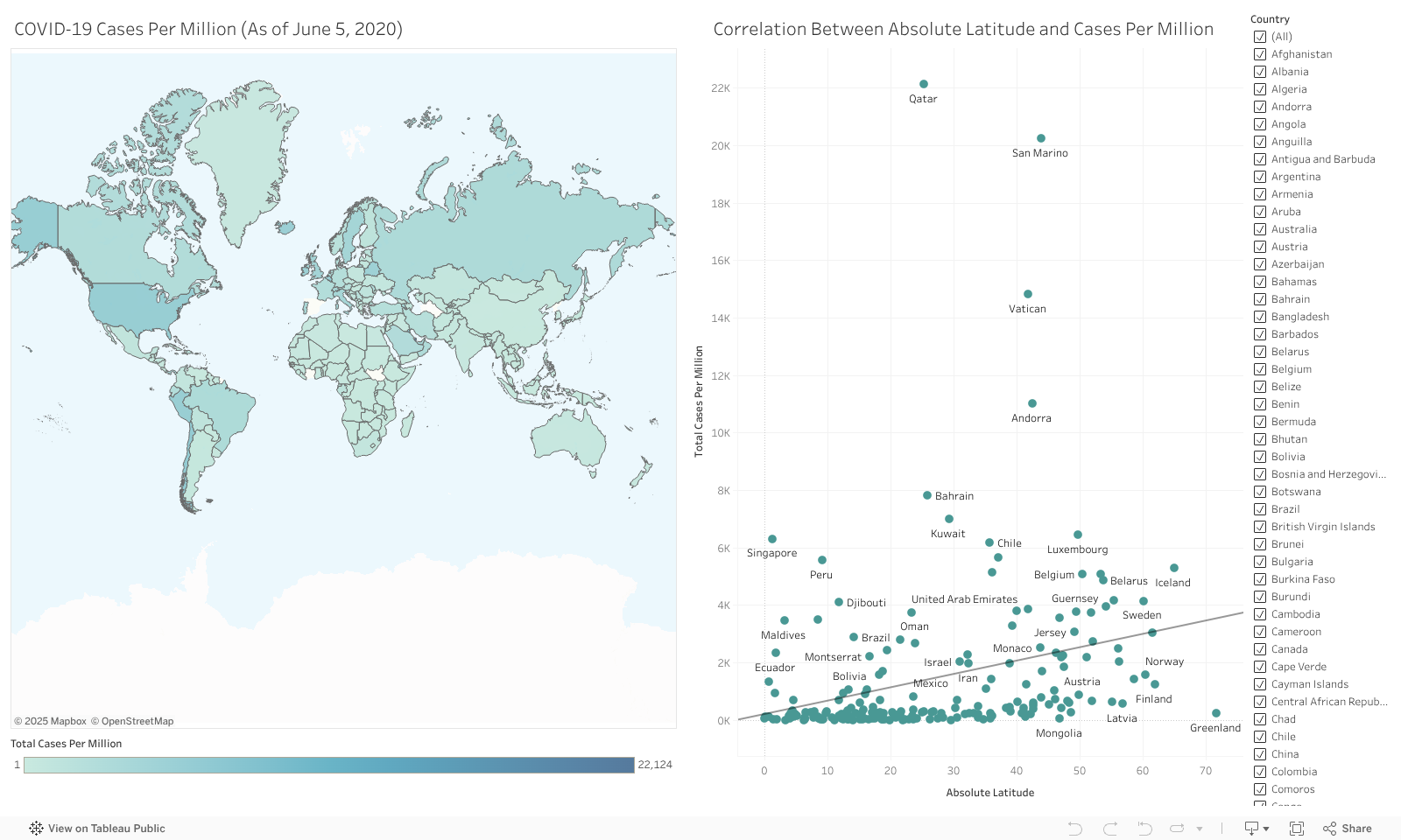

Description: These data visualizations illustrate the relationship between a country's distance from the equator (absolute latitude) and their COVID-19 cases and deaths per million. This accounts for differences in population.
Tip: To analyze how outliers may be skewing the results, try removing countries that appear to be outliers from the filter panel. For example, try removing Qatar or San Marino from the dashboards.
Conclusion: There is quite a lot of variability in the number of cases per million across the different countries. Overall, the general trend is positive which is outlined by the upward-sloping regression lines. This suggests countries farther from the equator have more cases and deaths per million. Similar to the graph looking at total cases and deaths, this correlation is also very weak as there are countries both close to the equator (ex. Singapore and Peru) and far from the equator (ex. Iceland and Sweden) that appear to have many cases and deaths per million.

Made with
Landing Page Maker